Design Guidelines
Messaging Components
There are a number of messaging components available for use. To choose a messaging element, you can refer to either Components or States as a starting point.
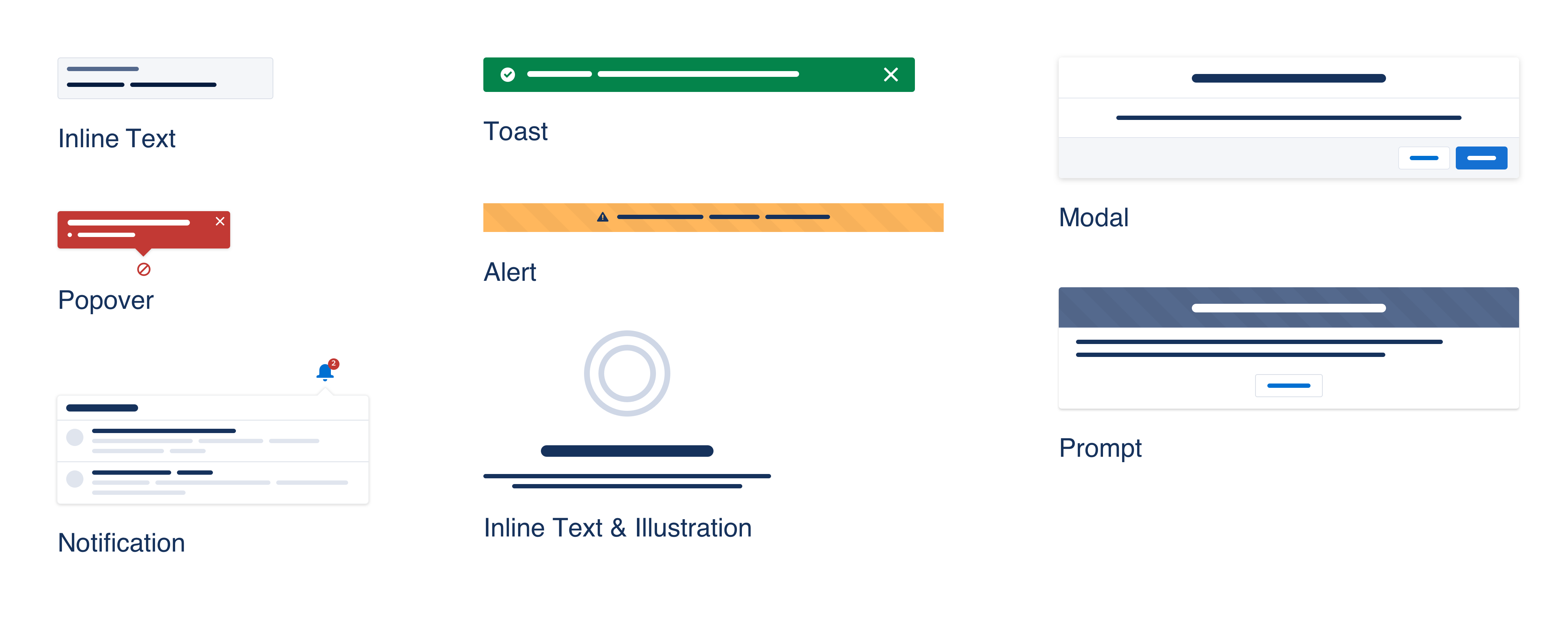
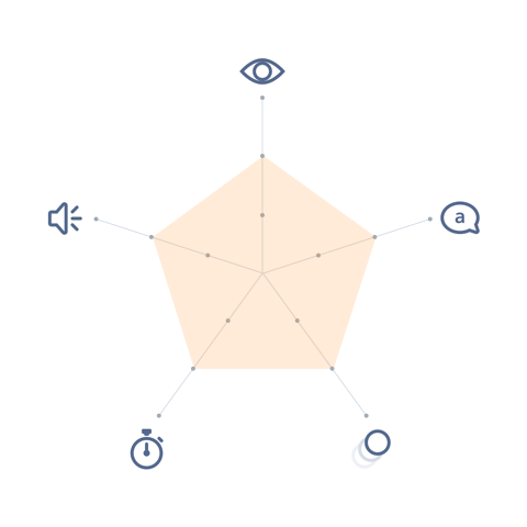
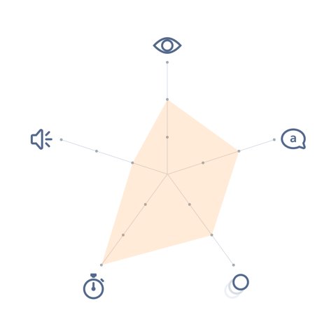
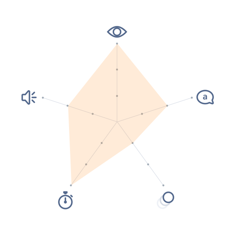
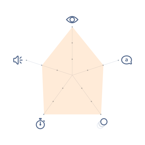
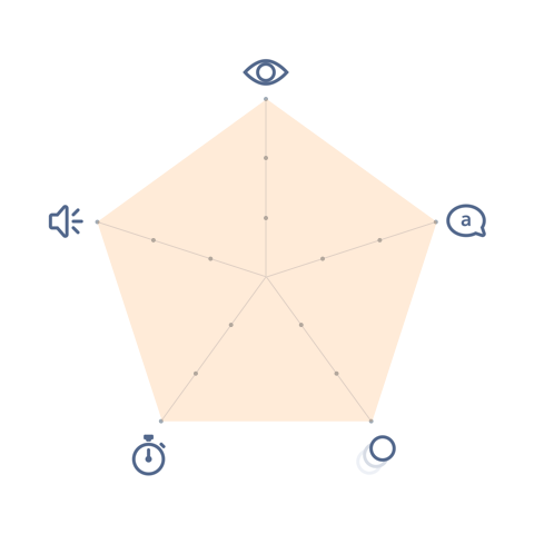
Each component has properties that determine their prominence. For example:
 Visual |  Voice & Tone |  Motion |  Duration |  Audio |
|---|---|---|---|---|
|
|
|
|
|
These properties are mapped to each component. Below is an example for “inline text” component.
Inline Text
- Visual: Camouflaged—Visible
- Voice & Tone: Conversational—Informational
- Motion: Static
- Duration: Permanent
- Audio: Muted
Once everything is mapped, an order emerges.
Least Interruptive
- less interruptive
- occupies a smaller section of the page, either as a component, alongside another component, or in a “card”
- is temporary, dismissible, or displayed inline
Most Interruptive
- “in-your-face”
- occupies the whole page or a large amount of space
- is either permanent or forces the user to take an action before disappearing